•
Stephan van Vuren
The map is the mission: how layered situational awareness decides outcomes in public safety, security and critical infrastructure
Ask an experienced incident commander what they reach for first under pressure, and most will tell you the same thing: a map.
The camera shows the scene. The map shows the scene in context: what is around it, what is above it, what is moving through it, what is downstream of it, and what is permitted within it. Without that context, a video feed is just a window. With it, the feed becomes a decision surface.
For operators in public safety, security and critical infrastructure, the quality of the map is the quality of the situational awareness it creates, and the quality of that situational awareness is the quality of the operation. A flat, undifferentiated map collapses every decision down to "what can I see right now." A well-layered map separates terrain, airspace, weather, traffic, infrastructure and intent, and it lets the operator decide on each independently.
This is the design problem AirHub has been working on for years. The platform is built as a map with operations running on top of it.
Base layers: the canvas the operator works on
Everything starts with the base layer. It is the map underneath all the other information, and it is the first decision an operator makes, sometimes without realising it.
Different base layers solve different problems.
Streetmap and road-style layers are the lingua franca of dispatch. Labels are readable, road networks are clear, and the cognitive load is low. They are the right default for an operator who is coordinating with patrol units, fire engines or ambulance crews.
Satellite and Google Earth-style imagery flips the priority. Roads become less important; terrain, vegetation, building footprints and water become primary. For search and rescue, wildfire response, perimeter security and any operation where the real-world shape of the ground matters more than its administrative labels, satellite is the right canvas.
Dark base layers matter more than people expect. A control room operating at night, or on a low-luminance video wall, will fatigue rapidly on a bright base map. Dark themes preserve contrast for overlays, reduce eye strain over long shifts, and let dynamic data such as aircraft tracks, drone positions and sensor alerts stand out cleanly.
Ortho photos and high-resolution aerial imagery are the specialist canvas. They are flown or sourced at far higher resolution than satellite, often updated more frequently, and frequently corrected for distortion so that measurements taken on them are reliable. For critical infrastructure inspection, planning around fixed assets, or post-incident reconstruction, ortho imagery shows what is on the ground today, captured far more recently than a satellite refresh cycle.
A serious operations platform lets the operator swap between base layers in one click, because the right canvas depends on the mission.
Added reference layers: the rules of the airspace and the water
Above the base layer sit reference layers. They are relatively static, and they remain critical for legal and safe operation.
Airspace maps are the most familiar of these. Controlled airspace, restricted areas, temporary flight restrictions, drone-specific geographical zones under the EU regulation, ICAO classes and military training areas are all invisible to the naked eye, and all of them constrain what an operator may legally do. A drone operator without an airspace layer is, in effect, flying blind to the regulatory environment around them.
Nautical charts matter the moment an operation touches water. Port authorities, coast guards, offshore wind operators, harbour police and search and rescue (SAR) teams all need to see what a maritime operator sees: depth contours, navigation channels, restricted maritime zones, anchorages and traffic separation schemes. A drone tasked over a harbour without the nautical layer underneath it cannot meaningfully coordinate with the vessels it is sharing the area with.
Other regulatory and reference overlays extend the same logic: protected nature reserves, no-overflight zones for critical infrastructure, national park boundaries, prison perimeters and embassy exclusion zones. Each of these is a rule of the world the operator works in, and each belongs on the same map.
Reference layers make rules visible at the moment of decision, well before the moment of audit.
Dynamic layers: the world as it is right now
Reference layers describe the rules of the world. Dynamic layers describe its state. They change minute by minute, they cannot be planned around in advance, and they are where situational awareness is won or lost.
Weather. Wind speed and direction at altitude, gust profiles, precipitation radar, lightning, temperature, visibility and ceiling. Weather is the single most common reason a mission is cancelled, delayed or re-planned in flight. Putting weather directly on the map lets the operator see the constraint exactly where it applies, in the same view they use to decide.
Airspace and aircraft traffic. Automatic Dependent Surveillance-Broadcast (ADS-B) feeds show cooperative manned traffic such as commercial aircraft, most general aviation and helicopters. FLARM extends that into the gliding, light aviation and rotor community where ADS-B coverage is patchy. Together they give a live operations view of who is sharing the sky. For a public safety drone over an incident scene, this is the difference between coordinating with the police helicopter and getting in its way.
Counter-UAS detection feeds. The same map that shows cooperative traffic can show non-cooperative traffic: drones detected by radar, RF sensors, acoustic arrays or Remote ID. This is the SecHub counter-UAS layer in the AirHub ecosystem, and it turns the map from "what am I flying" into "what is flying near me, and is it a threat." For a critical infrastructure site or a public event, that distinction is the whole operation.
AIS, vessel traffic. For any operation touching maritime space, Automatic Identification System (AIS) feeds show ships, their headings, their speeds and their classifications. A coast guard tasking a drone over a suspected smuggling vessel, a port authority verifying an arrival, or a harbour police force coordinating with patrol boats all need the AIS layer on the same map as the drone position.
Infrastructure overlays. Powerlines, railways, roads, motorways, waterways and pipelines. These layers serve two purposes. The first is operational planning: a powerline inspection programme is, almost by definition, a tasking against the powerline layer. The second is risk awareness. Knowing where the high-voltage corridor runs, where the rail line crosses, where the motorway is fenced and where the canal cuts through the area changes how an operator plans a flight, where they site a dock, and what they consider an emergency landing option.
Cell coverage and connectivity. For Beyond Visual Line of Sight (BVLOS) operations, for dock-based deployments and increasingly for tethered or fallback links, cell coverage now counts as an operational layer in its own right. Knowing that the planned flight path crosses a coverage gap is the difference between a successful BVLOS mission and a lost-link incident.
The common thread across dynamic layers is that they are real-time, external and operationally decisive. An operations platform that cannot ingest them is, at best, a planning tool.
Annotations: turning the map into a plan
Base layers describe the world. Reference layers describe the rules. Dynamic layers describe the state. Annotations describe the intent. This is where the operator stops consuming the map and starts authoring it.
Points of interest. A water hydrant, a rendezvous point, a known camera location, a contact at the perimeter, an entry door for tactical units, a fall-back assembly area. Points of interest carry institutional memory. The first responder on scene at three in the morning should not need to rediscover what the team that planned the site knew six months ago.
Waypoints and flight paths. The skeleton of any planned mission. Waypoints define the path the drone will fly, the speed it will fly at, the altitude profile it will hold, and the actions it will trigger along the way. On a well-built platform, building a mission means each waypoint carries a full instruction: payload triggers, camera angles and loiter behaviour, all attached to the coordinate.
Measurements. Length, area and volume measurements taken directly on the map and confirmed against ortho or LiDAR data. For inspection, search planning, evidence preservation and infrastructure assessment, the ability to draw a line and trust the number it returns is foundational. A measurement that needs to be exported, re-projected and re-imported is a measurement that will not be made.
Coverage estimates. For search and rescue, area surveillance and mapping missions, the operator needs to know what a flight will actually cover, given the sensor footprint, the overlap, the altitude and the speed. Putting that estimate on the map as a shaded polygon lets the commander see the gap before the asset takes off.
Operational areas with contingency volumes. This is the SORA-aligned core of modern unmanned operations. A flight does not happen at a point. It happens within a flight geography, surrounded by a contingency volume the aircraft may enter under specific failure modes, surrounded in turn by a ground risk buffer that protects people on the ground from the worst-case outcome. Drawing these volumes on the map is what makes an operation auditable, insurable and approvable by the competent authority. An operator who plans without contingency volumes and ground risk buffers is planning a flight that does not exist on paper.
Ground risk buffers. The outermost ring of the SORA construct. A buffer that reflects the kinetic energy of the aircraft and the ballistic trajectory of a worst-case failure. Visualising it on the map forces the planner to confront the question every regulator will ask: who is under this drone if everything goes wrong, and how have you mitigated that.
Annotations turn the map from a passive picture into an active plan. They are the layer where individual operator judgement becomes institutional process.
The compound effect: situational awareness from maps, video and telemetry
Each of the layers above is useful on its own. The compound effect is what makes a modern operations centre work.
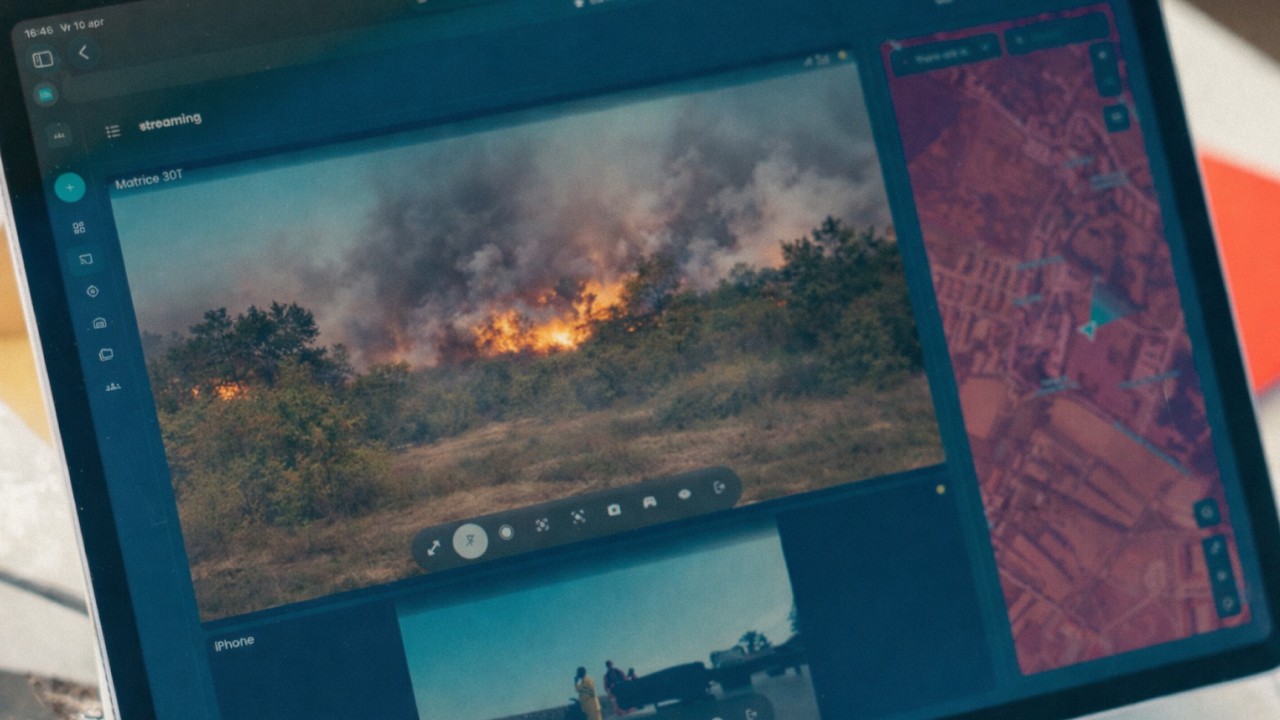
Picture an incident in practice.
A counter-UAS sensor reports an unidentified drone approaching a critical infrastructure site. On the operator's screen, the alert appears as a track on the map: base layer dark, ortho imagery cut into the site itself, airspace overlay confirming the airspace class, ADS-B confirming no cooperative traffic in the area, AIS showing two vessels in the adjacent waterway, weather panel showing crosswind within limits.
The operator launches a drone from the on-site dock. The aircraft position appears on the same map. Its live video appears in a tile pinned to its position. Its telemetry sits next to the tile: battery, signal strength, altitude and speed.
The planned mission shows as waypoints across the map. The contingency volume is visible as a hatched polygon. The ground risk buffer is drawn around the populated edge of the site. The patrol team on the ground appears as a bodycam feed and a position marker.
In one screen the operator already knows what is happening. The screen exists to answer the next question: what to do about it.
That is situational awareness. It is what happens when every layer sits in the same place at the same time.
Why layered situational awareness matters for the verticals AirHub serves
For public safety, the map is the difference between a coordinated multi-agency response and a fragmented one. Drone, helicopter, patrol unit, bodycam and dispatch all live in the same picture, and the commander makes one set of decisions instead of three. It is the same shared picture the Belgian Federal Police rely on for real-time situational awareness across teams.
For security, the map is the difference between alarm noise and confirmed incident. A sensor detection on its own is a question. A sensor detection with traffic, drone position, video and infrastructure context is an answer.
For critical infrastructure, the map is the difference between routine inspection and operational insight. The powerline layer, the dock-based drone, the weather overlay, the ortho imagery and the measured anomaly come together as a continuous picture of the asset that updates with every flight.
AirHub brings all of those layers, base, reference, dynamic and annotation, into the same operational view. SecHub adds the counter-UAS layer. MilHub adds the sovereign defence operating picture. The map is the spine across all three.
The camera tells you what is in front of you. The map tells you what to do about it.
Want to see every layer in one operational view, built around your own use case? Book a demo and we will walk you through it.